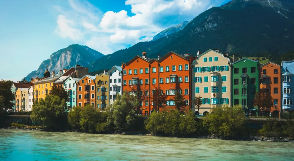
Designing with Color
Summary
In this post, I explore how color shapes the way we experience architecture and interior spaces, not only visually, but psychologically and physiologically. Through the lens of color psychology, we examine how different colors can evoke calmness, energy, warmth, focus, or restoration, while also considering how personal memory, culture, lighting, and materials influence our perception. We also reflect on the importance of pairing color with natural elements such as wood, stone, water, earth, and plants, reminding us that the colors found in nature can help create spaces that feel more grounded, peaceful, and connected to the Earth.
Color of Spaces
Color is one of the quietest yet most powerful elements of design. It surrounds us constantly, shaping how we feel, how we behave, and how we understand the spaces we live in. A room can feel calm, heavy, joyful, cold, sacred, sterile, or comforting before we even understand why. Oftentimes, color is part of that first emotional impression.
In architecture and interior design, color should not be treated as a final decorative layer. It is part of the psychological experience of a space. Color interacts with light, material, texture, climate, culture, and memory. It can influence whether a room feels open or enclosed, peaceful or stimulating, welcoming or overwhelming.
At Shizen Studio, we believe color should be considered with care because the spaces around us quietly shape who we are and our well-being.
Why Color Matters in Architecture and Interior Design
Architecture is not only about shelter. It is about creating environments where people can live, rest, gather, learn, heal, and grow. Since much of modern life is spent indoors, and the colors of our homes, schools, offices, hospitals, and public spaces can have a meaningful effect on our daily experience.
Research in color psychology and interior design suggests that colors can influence both psychological and physiological responses. Some colors may feel calming, while others may feel energizing. Warm colors may create excitement and stimulation, while cooler colors are often associated with calmness, focus, and restoration. However, color is never universal in a simple way. Personal memory, culture, lighting, material, and context all shape how a color is experienced.
This is why color design requires sensitivity. A color that feels joyful in one space may feel overwhelming in another. A color that feels peaceful to one person may feel cold to someone else. Good design does not simply ask, “What color looks beautiful?” It asks, “What kind of life, feeling, and behavior does this space hope to support?”
What Different Colors Can Evoke
Blue
Blue is often associated with calmness, clarity, stability, and peace. It can be especially helpful in spaces meant for rest, concentration, or quiet reflection. Physiologically, blue is often described as a cooling and calming color that may help slow the heart rate, lower respiration, and support a more relaxed state of the nervous system. Soft blues may support a sense of openness and tranquility, while very dark or excessive blue can sometimes feel cold or emotionally distant.
Green
Green is strongly connected to nature, balance, freshness, and healing. Because it reminds us of plants, forests, and growth, green can bring a restorative quality into interiors. Physiologically, green is often associated with relaxation, balance, and a reduction in physical tension, which may be one reason it is frequently connected to healing environments. Softer greens can feel peaceful and grounding, while overly saturated greens may feel artificial if not balanced with natural materials.
Yellow
Yellow is associated with warmth, joy, optimism, and energy. It can bring brightness into kitchens, hallways, creative spaces, or areas where people gather. Physiologically, yellow may feel stimulating because of its connection to alertness, energy, and brightness, but too much yellow can become visually tiring or overstimulating. For this reason, yellow often works best in gentle tones or as an accent.
Orange
Orange combines the energy of red with the warmth of yellow. It can feel social, creative, lively, and encouraging. Physiologically, orange is often described as stimulating and energizing, with associations to appetite, movement, and increased vitality. In small amounts, orange may support enthusiasm and conversation. In larger amounts, it can become too strong for spaces meant for rest.
Red
Red is one of the most physically stimulating colors. It is associated with passion, power, warmth, danger, appetite, and excitement. Physiologically, red may increase arousal by drawing attention quickly and is often associated with increased heart rate, respiration, and appetite. Because of this intensity, red can be effective as an accent color, but it may be too stimulating for bedrooms, meditation spaces, or environments meant to calm the nervous system.
Purple
Purple is often linked to creativity, depth, mystery, luxury, and spirituality. Deep purples can feel dramatic and sophisticated, while lighter purples such as lavender can feel soft and restful. Purple can work well when a space is meant to feel imaginative, reflective, or expressive.
White
White often suggests cleanliness, simplicity, openness, and light. It can make a space feel larger and brighter. However, too much pure white can feel sterile or emotionally empty if it is not softened by texture, warmth, or natural elements.
Gray
Gray is neutral, quiet, and versatile. It can create a calm background that allows materials, furniture, and artwork to stand out. Warm grays can feel elegant and grounding, while cool grays may feel more formal. If overused, gray can become dull or lifeless, so it often benefits from natural textures or soft accent colors.
Black
Black can suggest depth, elegance, strength, and mystery. When used carefully, it can create contrast and sophistication. However, too much black can feel heavy or enclosed, especially in spaces without enough natural light.
Color Is Not Only Paint
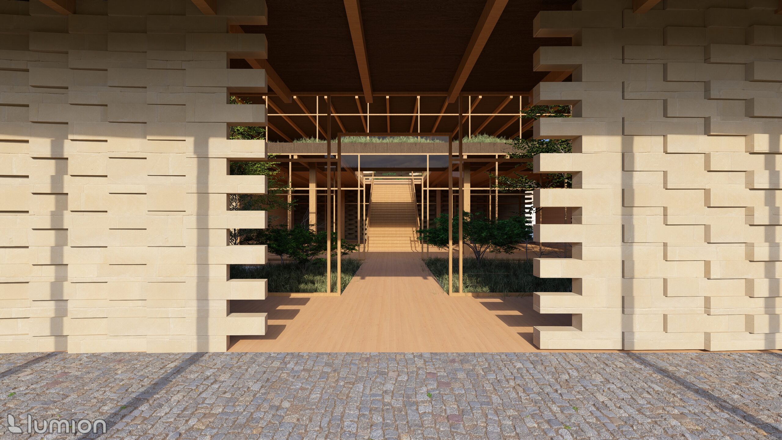
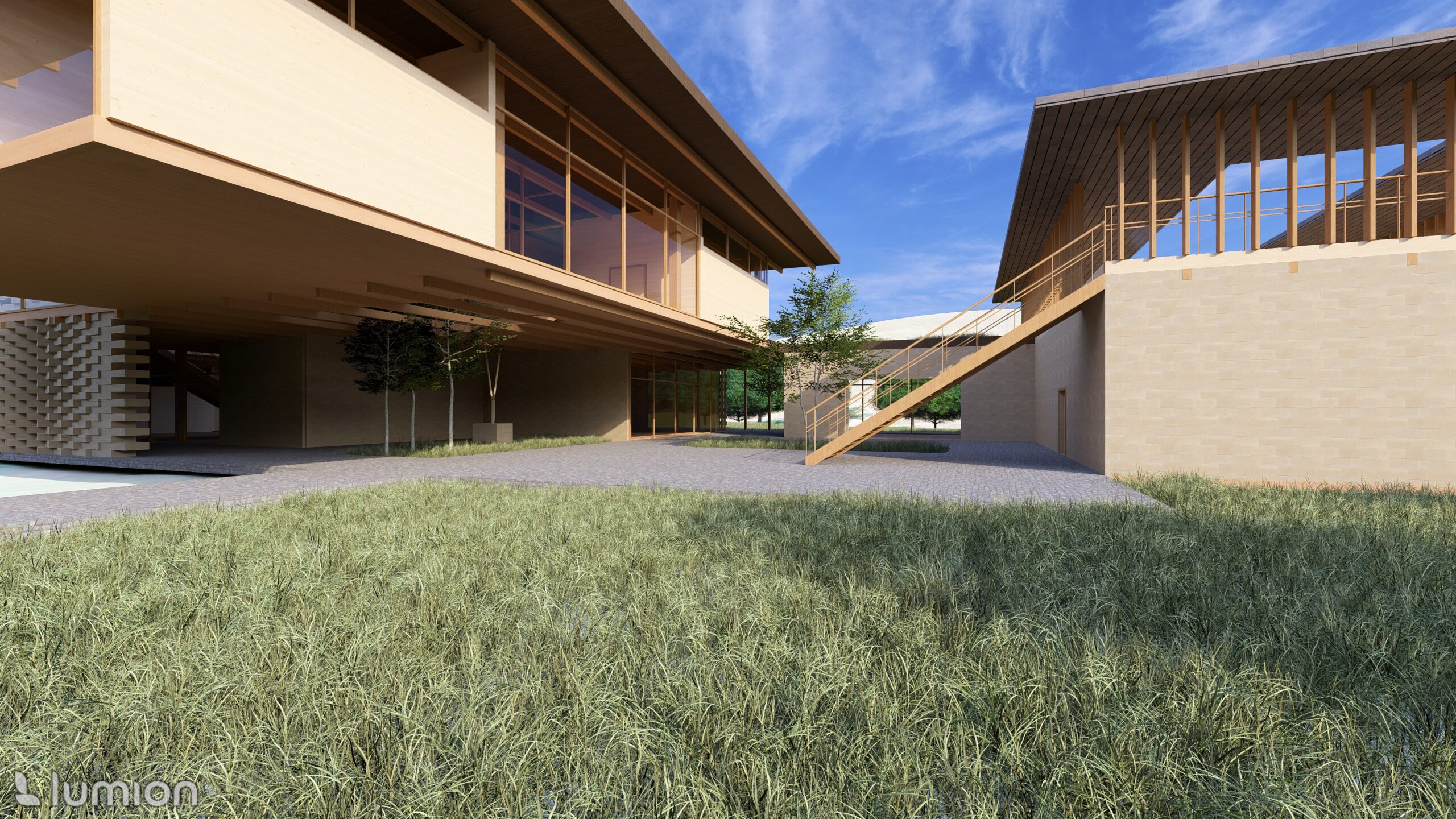
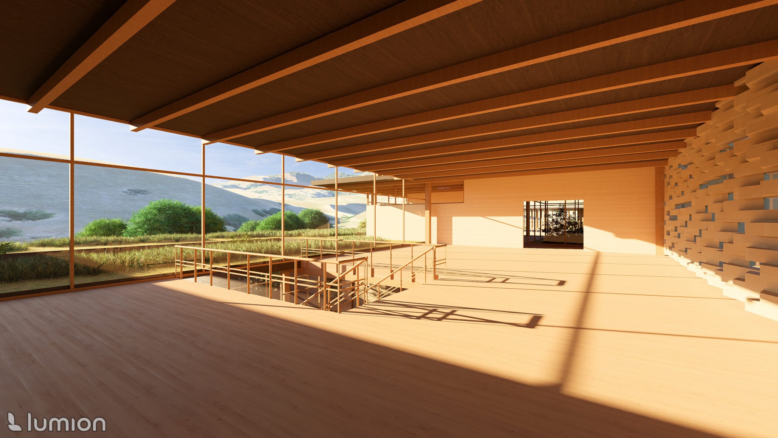
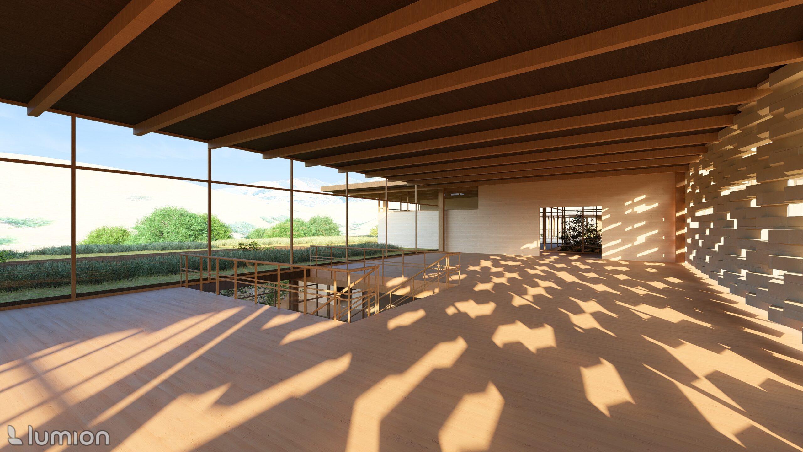
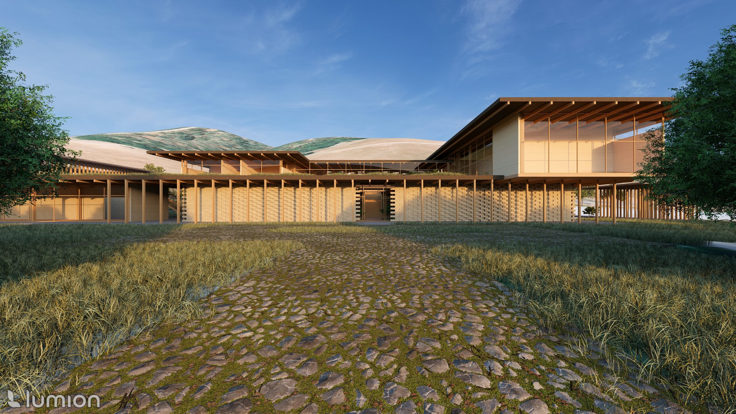
When people think of color, they often think of painted walls. But in architecture, color comes from much more than paint. It comes from wood grain, stone, brick, clay, rammed earth, water, shadow, plants, metal, textiles, and changing daylight.
This is where color becomes deeply connected to nature.
A wooden floor is not only “brown.” It carries warmth, age, growth, and memory. Stone is not only “gray.” It carries permanence, weight, and the presence of the earth. Water is not only “blue” or “clear.” It brings movement, reflection, and calmness. Brick, clay, and rammed earth bring tones that feel grounded because they come from the ground itself.
We believe that natural materials should always be considered part of color design. Wood, stone, water, earth, and brick can act as neutral colors in architecture and interior design. Color should always be paired with these natural elements. By doing so, you’re not simply filling a palette but bringing emotional depth, sustainability, and a reminder of our relationship with the Earth.
When the right colors are paired with natural elements, the psychological effect of a space can become stronger. A soft green beside wood may feel more alive. A warm white beside stone may feel more peaceful. A muted blue near water may feel more restorative. Earth tones, such as clay, brick, or rammed earth, may help a space feel rooted, humble, and connected to place.
Remembering the Colors of Nature
When thinking about color in design, it may help to first remember how we feel in nature. Think of standing beneath green trees, walking on brown soil, looking up at a blue sky with white clouds, noticing yellow flowers along a path, or sitting beside clear aqua water. These colors are not random decorations. They are part of the natural world that our bodies and minds have known for generations.
Why do we often feel more calm, open, and restored in these places? The colors matter. Green can remind us of growth and healing. Brown earth can make us feel grounded. Blue skies and water can create a sense of openness and peace. White clouds can bring softness and lightness. Yellow flowers can offer warmth, joy, and quiet hope.
Nature teaches us that color is most powerful when it belongs to a larger harmony. In the same way, architecture and interior design should not use color only for visual effect, but to help people feel more connected, balanced, harmonious, and at home in the world.
Toward a More Peaceful Future Through Color
If we want to create a more peaceful future, we must begin by paying attention to the environments we create every day. Color is a simple but powerful part of this work.
In homes, color can help create refuge from the speed and noise of modern life. In schools, color can support focus, curiosity, and comfort. In hospitals and care spaces, color can help reduce stress and support dignity. In public spaces, color can create identity, belonging, and connection to culture.
But peaceful color design does not mean making every space pale, quiet, or neutral. Peaceful design means choosing colors with intention. It means understanding when a space needs energy and when it needs rest. It means respecting culture, climate, natural light, and the emotional needs of the people who will use the space.
It also means moving away from artificial environments that ignore the Earth. Many modern interiors rely on synthetic finishes, trendy colors, and disposable materials. At Shizen Studio, we believe color should instead bring us closer to nature, memory, and gratitude. Natural colors and materials remind us that we are not separate from the Earth. We live through it, build with it, and depend on it.
More research is still needed on how natural materials and their complementary colors affect human well-being. We need deeper studies on how wood, stone, water, plants, earth, and natural pigments influence stress, attention, belonging, and emotional restoration. This research could help architects, designers, psychologists, and communities create environments that are not only beautiful but truly supportive of human life.
Color is not a small design decision. It is part of how a space speaks to the body, the mind, and the spirit, and through color, architecture can become more than shelter. It can become a gentle guide toward well-being, gratitude, and harmony with nature.
References
Ćurčić, A. A., Keković, A., Ranđelović, D., & Momčilović-Petronijević, A. (2019). Effects of color in interior design. Contemporary Achievements in Civil Engineering.
Enwin, A. D., Ikiriko, T. D., & Jonathan-Ihua, G. O. (2023). The role of colours in interior design of liveable spaces. European Journal of Theoretical and Applied Sciences, 1(4), 242–262.